Building This Personal Website
did you notice that the color theme mirrors the colors of the sky at various times of the day?
The Conception
When I entered college back in 2023, I had already begun to think about how I wanted my personal website to look, but the number of options I had overwhelmed me. In fact, early drafts of my design featured different aesthetics and complicated animations: a sort of Frankenstein of ideas I had gotten from cool sites I had seen during my visual design research era (I guess I got massive FOMO from seeing them all). Over time, I've embraced minimalism and cohesiveness, so I took the time to flesh out just one of the ideas: a night sky with animated clouds and twinkling stars, with glowing white text.
This idea evolved into a day/night theme slider that followed the color of the sky throughout the day, since I wanted more than just a binary toggle. I wanted a continuous sky— a slider from sunrise to deep night that interpolates a full palette. A hard part of this was getting all text to be readable anywhere the slider landed. I went through many iterations of picking colors and site layouts before finally settling on the one you see now.
The Process
I actually starting building out this site back in summer 2024, when I made this repository. I implemented the skeleton of the site, including routing and some basic navigation animations. It was very barebones and also just plain black. I didn't touch it again until summer 2026 oops. Why? Because the idea of actually going and implementing everything I planned for the site back then was incredibly daunting and I just didn't have that kind of time. Now, with the power of LLMs these days, it ended up being less than a 24 hour ordeal (thank you Cursor student pro free trial). Aside from the shame of not even touching the code much anymore— like, I literally command cursor to simply change button colors for me— it has been such an easy process. Actually populating the site with content was the hard part. You might've noticed that the [resume > high school] section has nothing. The reason is not that deep. I was just too lazy to add everything.
Breathing Life Into the Site
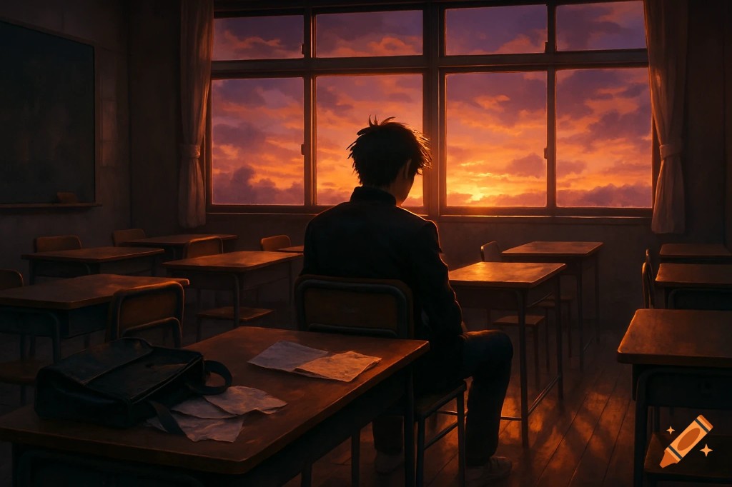
The site should feel like a romanticization of a classroom desk by a window: paper on the desk, weather outside, glass between. To me, this is really what it feels like (forgive me for the AI anime image, google search is overrun by AI images right now 😭):
Non-exhaustive list of the stuff that makes it feel less static:
- Glassmorphism — frosted panels (
backdrop-filter+ translucent fills) for the header, night cards, and other surfaces that should feel like glass between you and the sky. Graph paper stays opaque cream on purpose so you still have something solid to read on. - Framer Motion everywhere — page transitions, spring entrances, staggered blog-card hover (title nudge, excerpt shift, “read” reveal), filter/tab springs. If something eases instead of snapping, it's probably Framer.
- Parallax sky — day wash, outline clouds, and stars drift at different rates against scroll so the background feels deeper than a flat gradient. Clouds also idle-drift when you're not scrolling.
- Theme-driven weather — one slider value drives star intensity, constellation fade-in, night glow strength, and which surface treatment cards use.
- Home intro — typewriter welcome + name, then the name turns into scatterable pixel particles you can hover/drag apart (easter egg). Magnetic pull on the path CTAs.
- Polaroids — swipe/drag the stack; the top print tips toward the cursor with a little specular light.
- Nav chrome — sliding measured underline for the active page, hover underlines that grow in, per-letter tilt on path labels toward the pointer.
- Tabs / tags — inactive pills get a tiny gravity tug toward the active one; tag chips spring bounce on hover/tap.
- Favorites / cards — perspective tilt + light that follows the pointer; day cards lift, night cards get a soft travel/glow on hover (and on mobile when scrolled into view).
- About carousel — drag-to-scroll photos in a sketchy frame, with the next slide peeking.
- Night toys — star tethers (faint lines from cursor to nearby sky dots), scroll-triggered shooting star, home-only cursor particle trail.
- Extras — scroll-linked project video cards.
- Misc tactile bits — custom pull-to-reload spinner under the header, footer heart pulse, footer date scrub highlight as you mouse across the last-updated line.
The Stack
I'm too lazy to write more details, especially about the performance optimizations this took. I swear running this site locally caused my laptop to heat up so much that the temperature in my room actually went up a few degrees. I'll have AI spit out a blurb about it here:
| Piece | What I used | What it does here |
|---|---|---|
| Framework | Next.js 14 (App Router) | Routing, layout shell, static-ish pages |
| UI | React 18 + TypeScript | Components, typed theme tokens |
| Styling | Tailwind + globals.css | Utilities + theme/data-* overrides |
| Motion | Framer Motion | Transitions, springs, scroll-linked parallax |
| Content | Markdown + gray-matter + react-markdown | Blog posts as files, not CMS entries |
| Analytics | Vercel Analytics | Light page stats |
A few more technical details, since that's what this section is for:
- Continuous theme, not a toggle. A
timeValuefrom 0–100 lerps palette anchors (day → pink/blue twilight → orange dusk → periwinkle glow → night). Tokens land as CSS variables on<html>; bands also setdata-sunset,data-dusk,data-night-glow, etc. so CSS can specialize without duplicating the whole theme in two places. - Surfaces follow the sky. Cards use cream graph paper early on the slider, then glass deeper into night, with a blackboard treatment for some deep-night blog views. Paper always forces dark ink — otherwise twilight/night text colors wash out on cream.
- Sky is layered DOM/SVG, not a game engine. Outline clouds, star dots, constellations, and a day atmosphere stack under the content. Parallax uses pixel
scrollY(not scroll progress), because progress ≈ 1 on short pages and shoved the night wash into weird places. - Contrast was half the work. Readable text at every slider stop meant special-casing glass vs paper, header/footer luminance, and stopping night glow accents from painting lavender on cream titles.
- Performance pain points. Early builds remounted too much when the theme ticked, stacked too many live
backdrop-filters, and overdid layered box-shadow glows. Cutting remounts, thinning blur usage, and simplifying scroll math is what stopped the laptop from becoming a space heater. Still not "perfectly optimized," but it no longer feels like mining crypto in the background.
What's next?
idk, i might have a change of heart later and totally hate this design. until then, enjoy (and pls lmk if u find a bug or typo— i hate reading my blogs after i write them so i don't rlly look them over much)